SENTIR
STRATEGY/ IDENTITY/ LOGO/ NAMING/ TYPEFACE DESIGN
/opportunity/Sentir offers workshops in conscious crafts and mindful movement, to centre the mind and body. Owner and Founder Poly requested Sentir’s brand identity take inspiration from the surrounding waterways of Margaret River, her Chilean heritage, her collection of astrology and naturopathy texts, and the idea of bringing together two practices.
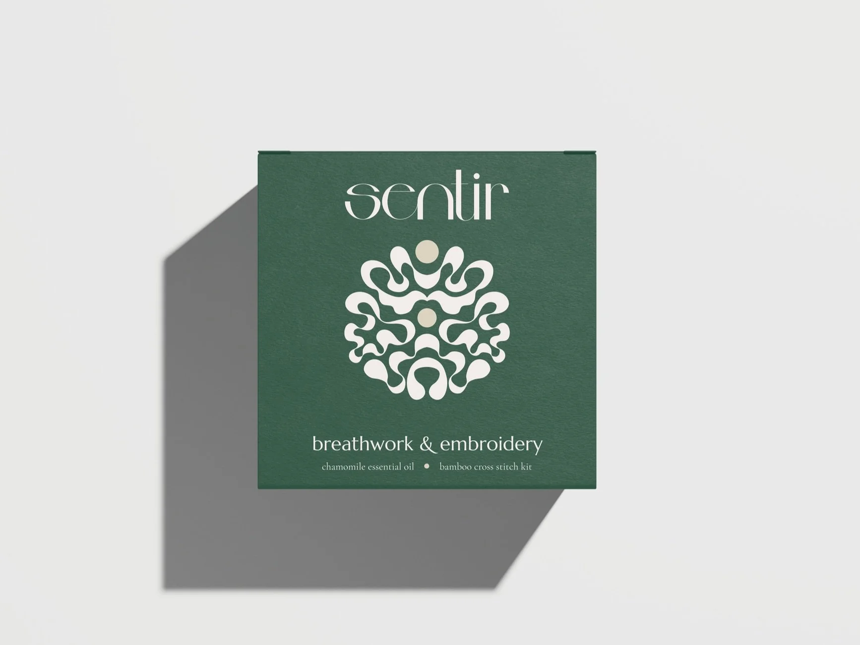
/execution/Sentir means “to feel” in Spanish, synchronously encompassing physical touch, emotional experience, and its English homonym, “centre”. The rich, muted colour palette is inspired by the iconic Valdivian forests and Atacama desert of Chile, while the custom logo typeface is a contemporary adaptation of calligraphy. Its geometric shape and thick-to-thin ebbs and flows are repeated in the brand mark, whose structure mirrors the brain, psychedelic patterns, the aerial appearance of rivers, and the fluidity of creativity. Ultimately, the brand mark symbolises flow — the mind state in which one experiences complete immersion and enjoyment. Its shape and scale embody strength and expansion, while its components symbolise the seven chakras — the central of which are highlighted to represent Sentir’s two offerings.
/strategy/To centre Poly’s culture in the brand name, I explored Spanish words that were at once simple and synonymous with the brand purpose — not only in their meaning, but in their phonetics. I looked to mirror serene Chilean landscapes in the colour palette, and identified common themes in Poly’s sources of inspiration to bring their essence through in the brand identity — formidability balanced with fluidity, and strength balanced with softness.


